*By Elijah Lovkoff, Founder of Web Engine, Web Design and Hosting company
Moving your business online? Beware of these 20 mistakes that can ruin your business website. Avoiding these pitfalls is a crucial step in ensuring your business website always stays healthy.
 Having been in web design for many years, we’ve heard numerous “horror” stories from business owners about losing their business due to their website crash. Actually, we are getting requests to fix broken websites almost as many times as to build new ones!
Not to overwhelm you with all 20 mistakes in one article, we’ve already written about 10 most common business website killers which are the following:
- Using free platforms (themes, templates) and plugins
- Not being careful with legal “paper work”
- Not hiring an administrator for website maintenance and support
- Important information below the page fold
- Too much customization
- Slow loading
- Not mobile friendly
- No Privacy Policy
- No clear understanding of search engines
- Not keeping your website updated
This article is about another 10 fatal mistakes in webdesign, business website maintenance and cyber security that you have to know about.
Here we go:
11. Poor Readability
Readability is one of the most important elements of your website design. If bizarre font styles and sizes are used, visitors won’t suffer reading it, they just leave. At the end of the day, you lose not them. Making your website easy to read improves the users’ reading experience.
While creating your site, you have to always keep in mind that visitors scan, not read, online. Make it easy for people to pick out information of interest from your site:
- Avoid large, uninterrupted blocks of text. Even if the information you provide is literally worth gold, most visitors will not bother finding it out.
- Include headings: they provide topical divisions and give readers an overview without forcing them to read the entire content. Headings are also very useful for SEO.
- Use bulleted lists and short paragraphs.
- Use images and other visual elements to visually break long texts because nobody likes an all-text experience.
- Remember that left-aligned text is easier to read than right-aligned text.
- Use white background with black body text wherever possible
- DON’T USE CAPITALIZATION FOR BODY TEXT, BECAUSE IT DECREASES THE CONTRAST BETWEEN LETTERS WHEN THEY ALL TAKE UP THE SAME SIZED BOX.
- Keep in mind that whitespace is vital for text readability.
12. Poor navigation
Okay, people land on your site. Now what? Do they know what to do? Where to go? What their next steps should be? Make your site navigation simple and clear, easy for users to find what they are looking for. If your navigation bar is poorly arranged, too small to read, too big to fit one line, or anything else that isn’t easy or convenient, then it needs to be fixed.

13. Unclear Call to Action
Your website serves a purpose. And visitors come to your site for that purpose, not to admire the site design. It needs to have clear call-to-action that tells visitors what to do. No one is going to take action (e.g. sign-up for a mailing list, make a purchase, request a quote, or simply call you) if you don’t ask them to do so.
14. Too many popups
People hate them. Too many web popups are a pain in the neck for anyone. Now, even Google punishes sites that use annoying pop-ups. According to Google, any popup that hides the main content on the website and that navigates the user to a page different from the search results will be penalized.
If you’re going to use pop-ups do it right, use them in moderation.
15. Not having a site map
You cannot overestimate the importance of site maps. There are two major types of site maps:
- Human-visible sitemaps which present a systematic view, typically hierarchical, of the site
- Sitemaps intended for web crawlers such as search engines
The second type of site maps is of utmost importance for your site, it’s what makes it visible for search engines. The Sitemap contains URLs to all pages so that web crawlers can find them. Google introduced the Sitemaps protocol so web developers can publish lists of links from across their sites. Bing, Google, Yahoo and Ask now jointly support the Sitemaps protocol.
16. Focusing too much on design trends
Focusing too much on the latest trends in web design without really considering their purpose can actually have a detrimental impact on the design. No doubt, staying current is important. However, a website that looks sleek and modern today could look outdated and cheesy in just a few months. You want to ensure that your design will look great for several years.
A beautiful site is great unless the design is so data-heavy that it takes too long to download. Visitors don’t like to be kept waiting. Even worse, with the Google Speed Update that went into effect in July 2018, Google has begun prioritizing rankings for sites that load faster than others.
Unless the purpose of your website is the get an award for the best design, focus on flat design, clean and minimalistic. Flat design helps a site fulfill a lot of the speed requirements that search engines are starting to require.
What is the use of a pair of beautiful shoes if they are too tight?
17. Missing Search Box
A search box is essential for any website, no matter whether it is big or small. It helps people find what they want if it is hidden within the website and not obvious at first glance.
18. Having auto-played multimedia content
Majority of us enjoy a silent browsing experience. When we are started bombarded with your theme song or a talking head on a video for which we didn’t press “play”, what do you think we are going to do? What would you do (especially if you can’t find the stop button)? At the very least, set your autoplay videos on mute and let your visitors choose to unmute them or not. No background music, please!
19. Having a Captcha
If you don’t want a feedback from your visitors, install a Captcha in your contact form. Do you really think that people will spend on average 10 seconds to solve a typical captcha? [https://en.wikipedia.org/wiki/CAPTCHA] Do you think that guessing the letters of a distorted image, sometimes with the addition of an obscured sequence of letters or digits that appears on the screen, is fun? Then you’ll have to think again.
20. Having a contact form only, no any additional contact written information
“Contact us” or “Send us an email” forms are actually lead generation killers. Especially when they are opened in a separate “Outlook” window, and the additional “yes-no” questions appear. It’s not only terribly generic, but it also doesn’t indicate whether or not the website managers actually want to get a feedback from you. Let people get in touch with you via email, the phone, and social media, and make that information written on your website.
The list of 20 business website killers
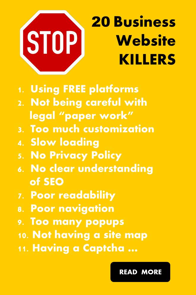
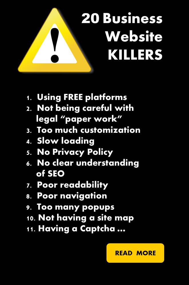
To wrap it up, here is the list of all 20 most common business website killers:
- Using free platforms (themes, templates) and plugins
- Not being careful with legal “paper work”
- Not hiring an administrator for website maintenance and support
- Important information below the page fold
- Too much customization
- Slow loading
- No Privacy Policy
- No clear understanding of SEO
- Not keeping your website updated
- Poor readability
- Poor navigation
- Unclear call to action
- Too many popups
- Not having a site map
- Focusing too much on design trends
- Missing search box
- Having auto-played multimedia content
- Having a Captcha
- Not mobile friendly
- Having a contact form only, no additional written info
And now, let’s finish considering all these serious matters with a joke: Nobody likes rats which belong to rodents. But beautiful squirrels with fluffy tails and cute striped chipmunks are rodents too. Porcupines are also rodents with sharp spines … It’s all about design and marketing.
Don’t you think it has a grain of truth?
*Should you be interested in talking to us or learning how we can help to advance your online business, please contact us here or simply call us at 416-871-0741


